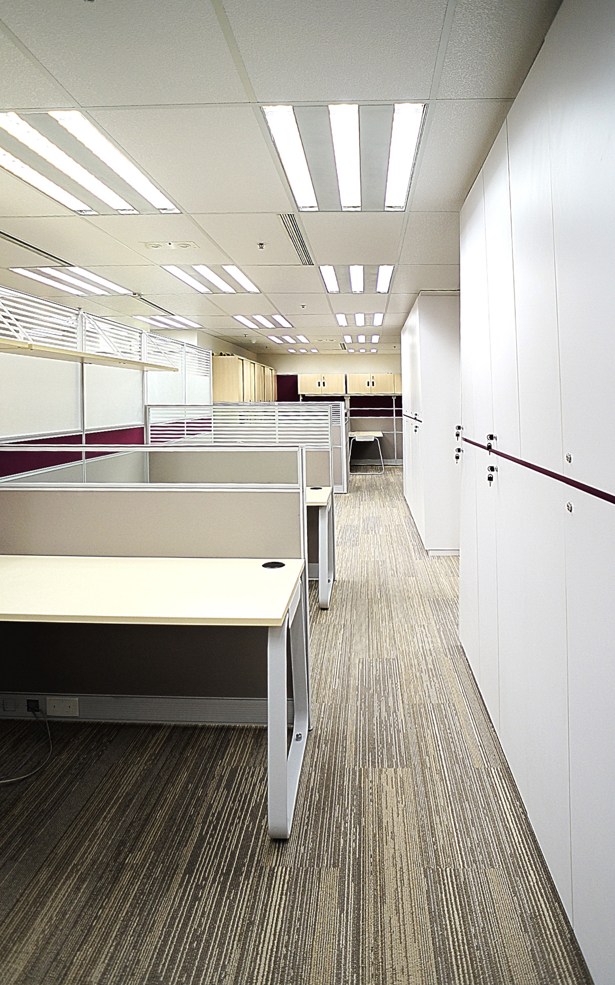
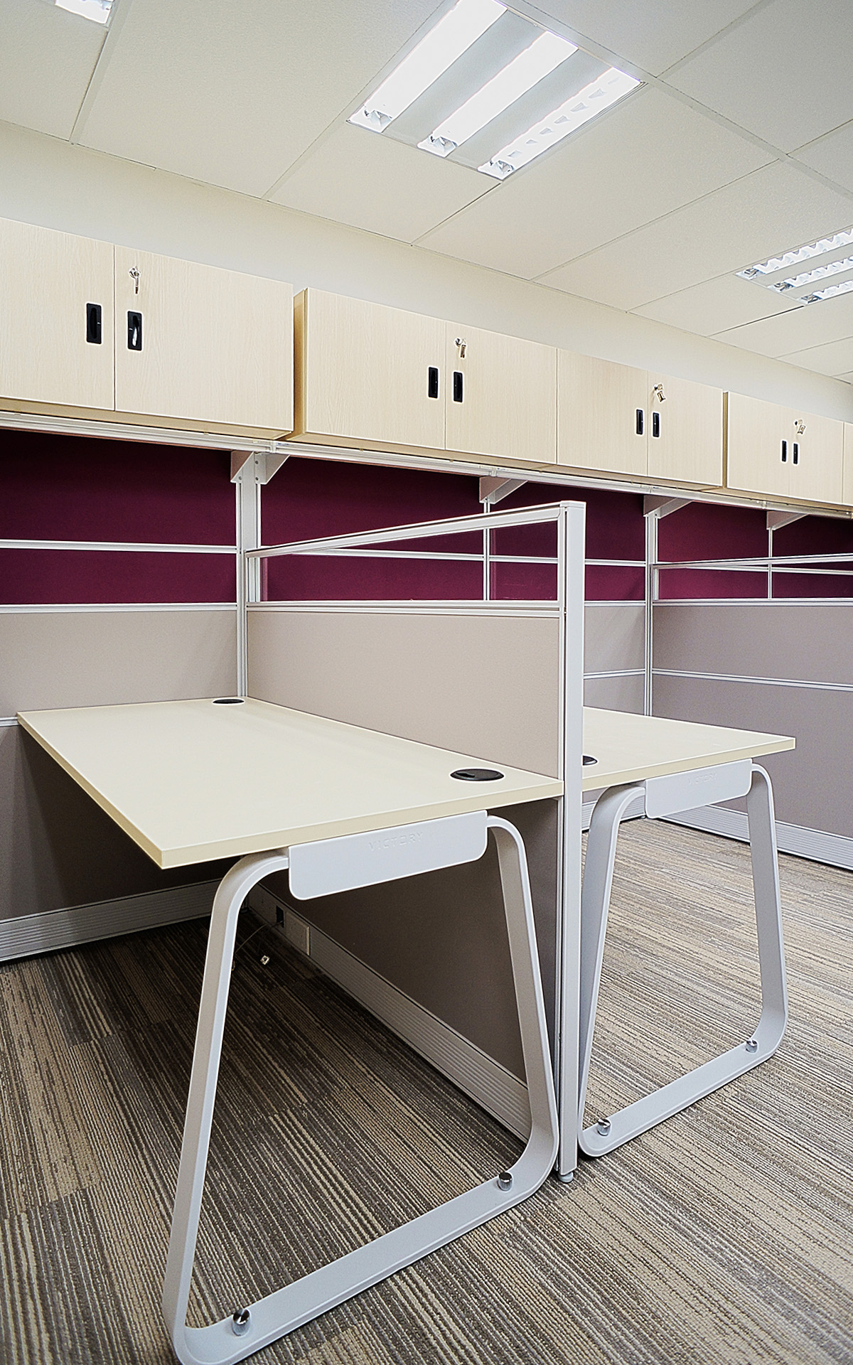
The design concept of “Luminous Balance ” interprets “Where White Meets Purple” captures the essence of a modern office design that merges the purity of white with the elegance of the brand corporate color purple. This enchanting fusion creates a captivating atmosphere, leaving a lasting impression on all who enter. Corporate colors in interior design helps reinforce and strengthen brand identity. It creates a consistent visual language that aligns with the company’s image and values. To further strengthen the brand image, the designer has extracted the initial of the brand, letter “A” to develop the interior design. From the reception space to the partition wall and the form of the boss working desk. The form of those are inspired by the form of the letter “A”.


